Colours of Venice
- Harriet Ruscoe
- Mar 24, 2019
- 2 min read
Top tip for Venice: Look Up! (and behind, down, sideways, round corners, through alleys, under bridges...)

I don't know if it just comes with being a designer or creative but one of the first things I notice when I'm in a new place is colour (then pattern, but that's a whole other blog post!). Venice, is full of traditional Italian, Mediterranean colours. From the muted terracotta and mustards of the city to the blend of the pastel and bright hues of Burano.
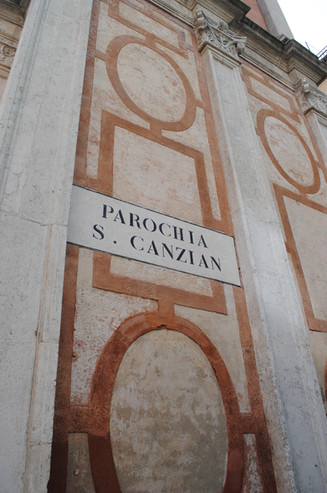
As we slowly meandered our way through the beautiful alley ways of Venice, being sure to go slightly off the tourist track. I couldn't help but almost constantly click my camera away. Much to the bemusement of many other tourists. Accept for a group of photography students. Who found themselves photographing the same pastel pink building with sky blue shutters as me, behind a group of street food trucks, where the only other people were sweaty chefs and hurried servers. We gave each other a nod and a smile.
So let's start with the pinks...and the reds of Venice.


One of my favourite colour palettes this season. Buildings in the city and lined along the Grand Canal are washed with pale rose pinks, vibrant tangerines, muted raspberry and pink grapefruit tones.


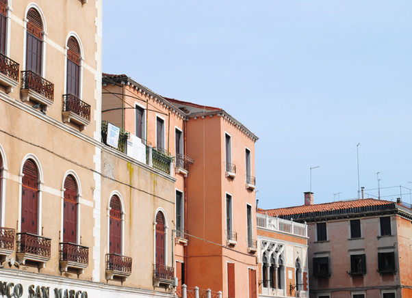


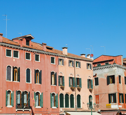


Now, this is my "edit" of photos from this colour palette. Tones of oranges are by far the most popular choice of colour in Venice architecture, not surprising as the most accessible building materials are brick, wood and Istrian stone. Traditional Mediterranean hues feature across buidlings from rich golds, bold corals and terracotta's to soft peaches and salmons.


Mingled in with the oranges are the yellows of Venice. Pale lemons, vibrant buttercups and dark honeys and mustards. Beautifully co-ordinated with the blue tones of the shutters.


Which brings be nicely on to my favourite, colour palette of the city...The shutters and doors. Another traditional hue of Venice and Italy is teal, particularly used on window shutters. Some say arsenic was used as paint in the 18th Century, which just so happened to be green in colour, to help deter bugs and insects getting through the windows. However, this seems to be a myth and in fact the teal green colour used is just the traditional choice of Venice.
From teal and vintage turquoise to vivid cobalts and pastel shades, the colours of the shutters were the reason I kept looking up!
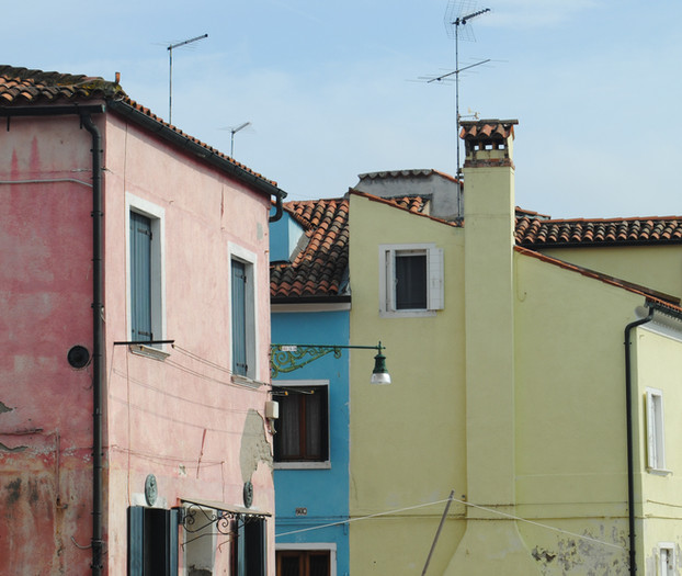
Finally, I couldn't end a "Colours of Venice" blog without mentioning the island of Burano. The fishing and lacemaking village, situated in the Venetian lagoon, famed for its bright and pastel coloured buildings lining the small canals. Each house with an equally colourful fishing boat moored up outside. The eye-catching colours of the island have been part of tradition for decades. Houses are painted in a different colour to their neighbour with approval of any colour choice needed from the community government (A government job I could get on board with!).


If you're in need of more Venice inspiration, look out for my next blog post: Patterns of Venice!